Article Text

Abstract
Objectives: To compare methods for defining the population at risk from a point source of air pollution. A major challenge for environmental epidemiology lies in correctly identifying populations at risk from exposure to environmental pollutants. The complexity of today's environment makes it essential that the methods chosen are accurate and sensitive.
Methods: Environmental and mathematical methods were used to identify the population potentially exposed to a point source of airborne pollution emanating from a waste incinerator. Soil sampling was undertaken at 83 sites throughout the city and environs. The concentrations of arsenic and copper were measured at each site. Computer software produced smoothed contour plots of the distribution of arsenic and copper in the soil based on the information derived from the sampling sites. The population at risk was also identified using concentric rings of varying radii, with the source of pollution at the centre. Lastly, we used the sites that had previously been selected and measured the frequency of wind direction, speed and distance from the source of pollution at each site. Theoretical contour plots were constructed using the distance from the source of pollution at each site, with and without incorporating wind frequency as a function of direction.
Results: Each method identified different populations at risk from airborne pollution. The use of circles was a very imprecise way of identifying exposed populations. Mathematical modelling that incorporated wind direction was better. Soil sampling at many sites was accurate, as the method is direct; but it is very costly and the close proximity of high and low concentrations hindered interpretation. The smoothed contour plots derived from the soil sampling sites identified an exposed population that was similar to that derived from the spot sampling.
Conclusions: Using circles as the only means of identifying the exposed population leads to dilution of the potential health effect. The best approach is to use local knowledge about wind direction and speed to estimate the population likely to be at risk; to back up this estimate by judicious use of soil sampling; to use contour mapping to guide the final selection of exposed and non-exposed populations; and finally, to interpret the populations identified as being at risk by incorporating information about other potential sources of pollution (past and present) in the area.
- environment
- exposure assessment
Statistics from Altmetric.com
A major challenge for environmental epidemiology lies in correctly identifying populations at risk from exposure to some environmental contaminant. The main routes of exposure are air, soil, and water; in this paper we consider only exposure to air pollution emanating from point sources. Essentially three methods may be used to identify populations at risk from point sources of pollution: some sort of physical monitoring, environmental monitoring, or mathematical modelling; each of the methods incorporates several approaches (table 1).
Methods available for identifying populations at risk from airborne pollutants
Physical monitoring of the plume from a fumestack may be used to identify exposed populations accurately. Such an approach may use a tracer material in the plume and aims ideally to monitor at various wind speeds and under varying weather conditions. This approach is the gold standard for identifying exposed populations as it allows objective assessment of the content of the plume. But there are several drawbacks. Its use is dependent on the goodwill of the industry, as they must allow access to the fumestack. It is an expensive option for most research projects that requires skilled personnel. And, clearly, it is impossible to monitor the plume if the source of the pollution has finished operating. Another approach is to build a scale model of the town, city, or community in question; to include a scaled replica of the fumestack; and to study the flow of the plume from the fumestack in a wind tunnel experiment under varying wind speeds.1 This method also requires considerable experience in the technique, takes a great deal of time to set up and requires complex apparatus to control and monitor the wind tunnel.
Environmental monitoring may be used to identify exposed populations. This method uses sampling of air, soil, water, or vegetation, with or without the addition of contour plotting derived from the concentrations of contaminants at spot sites. A classic example of this approach was the Seveso investigation in northern Italy2 when a reactor exploded at a chemical plant in Seveso. A toxic cloud formed which was heavily contaminated by 2,3,7,8-tetrachlorodibenzo-p-dioxin. The researchers identified the exposed population using the wind direction at the time of the explosion and undertook detailed soil sampling for the presence of 2,3,7,8-tetrachlorodibenzo-p-dioxin. With this knowledge a study area was identified2,3 that contained three zones—each representing differing risks of exposure to pollution. Extensive sampling of materials including soils was also used in a study that investigated the incidence of lung cancer and residential proximity to a steel foundry.4–6 One drawback of environmental monitoring is finding the considerable expertise and finance that are required in the collection and analysis of the samples, which may render environmental sampling impracticable when investigating several locations.
The final approach for identifying exposed populations is through mathematical modelling. At its most simple, mathematical modelling uses circles of varying radii with the source of pollution at the epicentre.7–9 For example, researchers in Scotland used this approach when they designed a study7 to review the animal and human health in the vicinity of a chemical waste incinerator. The incinerator was situated on the outskirts of a town with a population of 9000. The exposed population was identified by placing the incinerator at the epicentre of a circle, with a radius of 5 km. Another study used circles8 when investigating the relation between residential proximity to incinerators of waste solvents and oils and the incidence of cancers of the lung and larynx at 10 sites throughout the United Kingdom. The populations at risk were identified using circles at each incinerator site and within two bands of circles of <3 and 3–10 km. A more complex approach incorporates, either singly or in combination, local knowledge about wind direction and distance from the point source.
Commercially available software can then be used to draw contour plots that identify the exposed populations. Atmospheric dispersion modelling software is widely available. Such software can incorporate information about wind direction and speed, operating temperatures, stack heights and volumes, and composition of waste to be handled. An example of this type of software is the industrial source complex long term (ISCLT2) model. It is the software and model preferred by the United States Environmental Protection Agency. The model allows the user to input many local characteristics—such as meteorological data, wind speed and direction, the characteristics of the stack flue, and exhaust emissions. The success of the modelling is dependent upon the accurate representation of the local characteristics. Output from modelling software should be reviewed carefully and checks made about the accuracy of the local characteristics applied to the model.
Society today is exposed to a multitude of complex chemicals for which the health outcomes are largely unknown. If environmental epidemiology is to contribute to the elucidation of the relation between pollutant and health outcome then it is imperative that the method is improved to accurately define exposed populations. In this paper we describe the ways that we used to identify the population at risk from airborne pollution in a city of about 180 000 inhabitants.
METHODS
We used environmental monitoring and mathematical modelling to identify the population at risk from airborne pollution potentially emanating from a waste incinerator. We were unable to use physical monitoring because the source of pollution had stopped operating when we undertook our study; we do not have the facilities for constructing wind tunnel experiments.
Environmental monitoring and modelling
An historical and contemporary investigation of all possible sources of airborne pollution was undertaken within the vicinity of the source of pollution. We located on an OS map of the city and environs all landfill sites and all industries with part A or part B processes.10 The Scottish Environmental Protection Agency categorises prescribed processes as falling under the description of part A or part B processes. Part A processes are regarded as the potentially more polluting and technologically more complex processes. Part A processes are controlled by integrated pollution control and are regulated for release of polluting substances to the three environmental media of air, land, and water. Part B processes are prescribed processes that are regulated by local control of air pollution. These processes result in emissions to air alone and are regarded generally as the less polluting processes. We also reviewed the city's Calendar from the early 1900s until the early 1970s. These calendars include a list of all industries operating at the time of the print run of the calendar. While it gave an idea of the range of industry to be found in the city during the earlier part of the 20th century, their use was limited because the industries were not referenced by a full postal address.
We explored the geographical extent of the potential pollution by carrying out extensive soil sampling at 83 sites throughout the city and environs. The selection of these sites was not uniform across the city. Denser sampling was carried out in the area that our local knowledge about wind direction and speed indicated would be most affected by airborne pollution emanating from a point source. Thus they were most dense to the west and southwest of the waste incinerator. We largely ignored the north east of the incinerator as this area was farming land with a low population density. All sampling sites were undisturbed, away from traffic, avoided footpaths, horse trails, and rubbish bins, and were not shaded by trees or by buildings. The soil was air dried to a constant weight at a temperature of less than 30°C. Stones greater than 10 mm were removed by handpicking from the air dried sample. Once prepared, the soil samples were extracted with a mixture of hydrochloric and nitric acids. The trace element content of 16 heavy metals that are known to be liberated from our type of source of pollution was measured by atomic absorption spectrometry. We report the concentrations of arsenic and copper. Both heavy metals are a byproduct of waste incineration. Unlike arsenic, copper may be a less specific marker for a point source of pollution in an urban setting due to the ubiquitous nature of copper piping. By contrast, copper would be a better marker in a rural setting as arsenic is also widely found in pesticides and herbicides.
A computer package for handling georeferenced data (GS+)11 was used to produce maps of the distribution of arsenic and copper that we found in the 83 sites within the city and environs. This package first performs semivariance analysis, which produces a variogram model of the autocorrelation that is present in the data. Within semivariance analysis, the user is allowed to choose between an isotropic model (that assumes that the dispersion of pollution is the same in all directions) and an anisotropic model (which assumes that the dispersion of the pollution differs in different directions). We selected the anisotropic option as this allows for (wind) direction in its calculation. Kriging, which interpolates values for points not physically sampled, is then used to generate optimal estimates for the concentrations of arsenic and copper at evenly spaced intervals within the range of coordinates entered into the database. Kriging performs better in some settings than others. It works well when kriging pollution concentrations with the “semivariogram” methods (AB Lawson personal communication).
Mathematical modelling
Firstly, we identified the exposed population using concentric rings, with the source of pollution at the epicentre and with radii of 1, 2.5, and 5 km.
Secondly, we drew theoretical contour plots using the distance from the source of pollution at each site, and then for distance divided by relative frequency of wind from the direction of the source of pollution. The purpose of this was to confirm that a contour plot based on the sites resulted in concentric circles, and that the modification of distance by wind frequency resulted in an elongated distribution along the south west-north east axis.
We used the 83 sites within the city that had been used for the environmental monitoring and calculated, at each site, the wind speed and direction (from a wind rose that had been constructed at a local airport) and distance from the source of pollution. We calculated Spearman's correlation coefficients to explore quantitatively the association between the concentrations of arsenic and copper and distance from the source of pollution. SPSS was used to perform a multiple regression of metal concentration on distance from the source of pollution and relative frequency of wind from the direction of the source, for different wind speeds: light (<11 knots), moderate (11–21 knots) and strong (≥22 knots). All the data were log transformed and the results are displayed as standardised regression coefficients.
RESULTS
The point source of pollution was located on the eastern fringe of a city. One landfill site was about 2 km southwest of the point source but most were on the northern or eastern outskirts of the city. Industries with part A and part B processes were found throughout the city. Only one industry was in the immediate vicinity of the point source. Consultation with the Scottish Environmental Protection Agency showed that there was unlikely to be any overlap in the types of pollutants that potentially could be liberated from either source.
Environmental monitoring and modelling
The sites of soil sampling are shown in figure 1 A and B. The mean (SD) concentrations of arsenic and copper in the soil in the city were respectively 8.75 (2.6) mg/kg and 48.6 mg/kg (32.9). In the United Kingdom, the official advice is 10 mg/kg or less arsenic in soil is safe for residential land12; 22% of the sites were above this concentration and are shown in the figure as red dots (fig 1 A). The safe concentration of copper in residential land is 130 mg/kg or less12; 5% of the sites were above this level and are shown in the figure as red dots (fig 1 B). Sites that are below the United Kingdom limit are shown as blue dots (fig 1 A and B).

(A) Distribution of soil sampling sites. Red dots show sites with high concentrations of arsenic, blue dots show sites with normal concentrations of arsenic. (B) Distribution of soil sampling sites. Red dots show sites with high concentrations of copper, blue dots show sites with normal concentrations of copper.
We used commercial software (GS+) to produce smoothed contour maps for arsenic and copper (fig 2 A and B). The maps represent the area of city and environs shown in figure 1. The maps show the log transformed distribution of arsenic and copper because both metals had skewed distributions. Areas with high pollution and areas with low pollution are seen in the distributions of both metals.
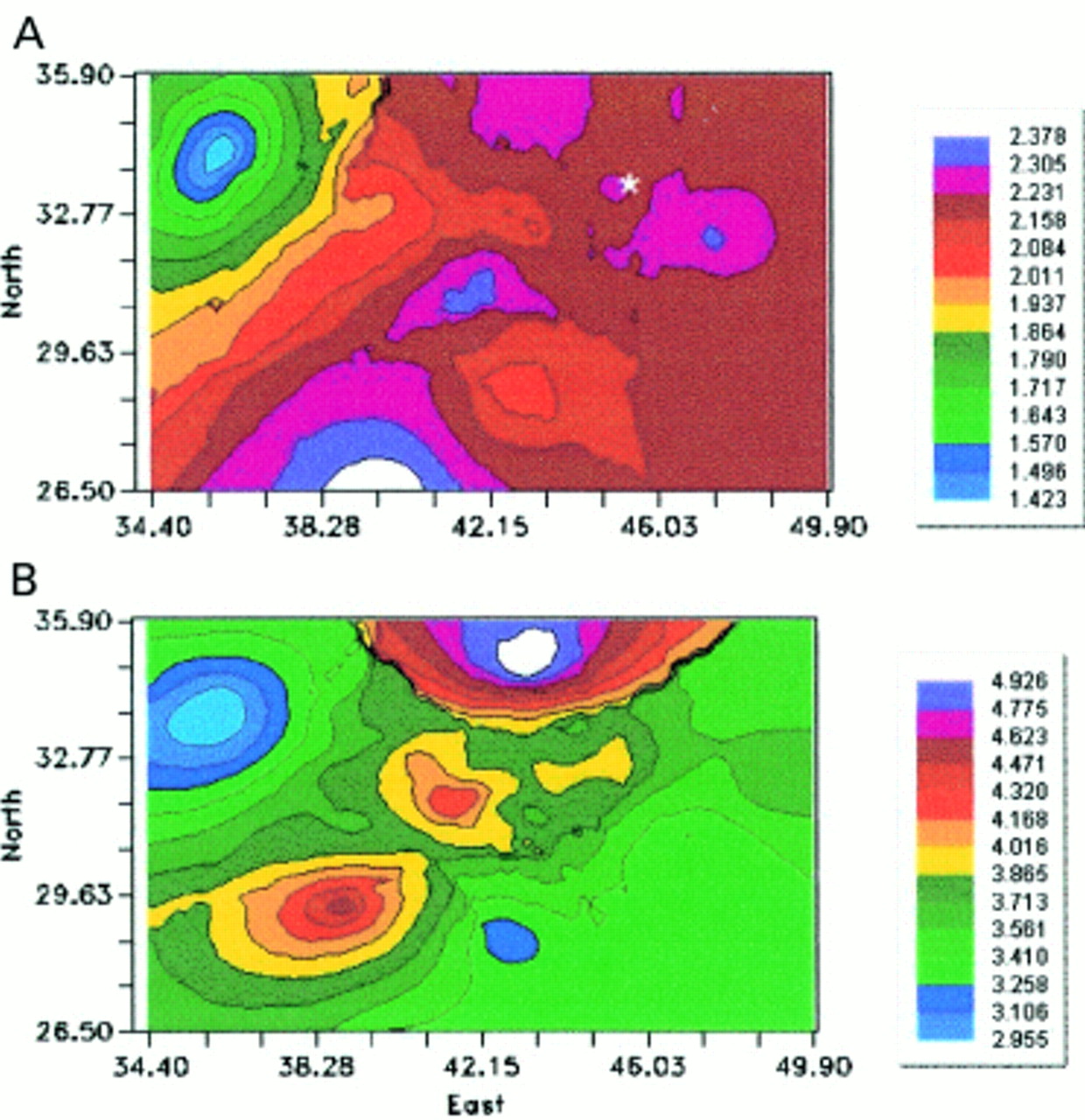
(A) Contour maps showing of the smoothed, log transformed distribution of arsenic. *Marks the putative source of pollution at 44.5 33.0. (B) Contour maps showing of the smoothed, log transformed distribution of copper. *Marks the putative source of pollution at 44.5 33.0.
Correlation analysis showed that both copper and arsenic were significantly negatively associated with distance from the source of pollution, and that arsenic was negatively associated also with wind frequency (table 2); standardised regression coefficients of metal concentrations with log distance and with wind frequency are shown in table 3. The standardised regression coefficients of metal concentrations on distance from the source of pollution showed a moderate but significant negative correlation with distance from the source of pollution for copper only. The incorporation of wind speed in the approach was more difficult to interpret because when distance was taken into account, the effect of direction was no longer significant, albeit the distributions were more associated with moderate wind speeds.
Results of Spearman's correlation analysis between copper and arsenic, and distance and distance/frequency of wind
Standardised regression coefficients for copper and arsenic on log (distance)
Mathematical monitoring
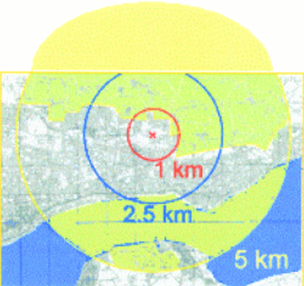
The circles of differing radii identified areas of exposure covering between 3.14 km2 and 78.58 km2 (fig 3). Up to 50% of the area identified as exposed to potential pollution contained no inhabitants, or only a very disperse rural, population.

The geographical extent of the exposed population delineated by circles with three varying radii, and with the putative source of pollution at the epicentre.
The contour plot of distance shows, as expected, a series of concentric circles. By contrast the contour plot of distance weighted by frequency showed an elongated distribution along the north east-south west axis. The theoretical distribution of the extent of the pollution differed appreciably when only the distance from the point source was used and when distance and wind direction were considered. Not unexpectedly when distance only was used, the distribution of the pollution from the source declined in circular bands (fig 4 A). By contrast, when distance and wind direction from the source of pollution was considered the pattern of distribution was elongated along the axis running from north-north east-south-south west axis (fig 4 B).

(A) Theoretical distribution when only distance from the source of pollution was considered. *Marks the putative source of pollution at 44.5 33.0. (B) Theoretical distribution when distance divided by relative frequency of wind direction from the source of pollution was considered. *Marks the putative source of pollution at 44.5 33.0.
DISCUSSION
This paper has identified strengths and weaknesses associated with the different methods for identifying populations that are potentially exposed to airborne pollution emanating from a point source of pollution.
The use of circles seems a very imprecise way of identifying exposed populations and there are several ways in which they might distort the magnitude of the health effect. Their arbitrary use prevents the exclusion of other sources of pollution within the area. No account is taken of the height of the fumestack and the speed of the plume on the creation of an umbrella protection on the land and population at the foot of the fumestack. And most importantly, no account is taken of the impact of wind direction and speed on the dispersal of the plume. In our example the geographical area covered was very variable depending on the radii used and encompassed between 3.14 km2 and 78.58 km2. Although the potential for dilution of any health effect may be minimal with a radius of 1 km, the extent of the dilution when expanding to radii of 2.5 km and 5 km is appreciable. Had the shaded areas in figure 1 contained much population the dilution effect would have made it impossible to ascertain any relation between residential proximity to the source of pollution and ill health. The impact of dilution using this circular approach is apparent in other studies. For instance, the example from Scotland mentioned earlier7 did not find any adverse health in the exposed human population. Their study area covered 78.6 km2 and encompassed a population of 38 000, which swamped the population of the town with the chemical waste incinerator by a further 29 000. The level of dilution was so high that it was hardly surprising that the researchers failed to find much evidence of ill health. By contrast, studies that used more sensitive methods to delineate the exposed population reported a very different picture.13–15
Studies that use varying radii but which investigate several putative sources of pollution simultaneously still run the risk of inappropriately defining the exposed population, but are cushioned by the inclusion of many sites. For instance the work of Elliott et al8 around 10 incinerators of waste solvents and oils concluded that there was no association between laryngeal cancer and proximity to incinerators. By contrast an earlier study,16 at one of the incinerator sites, reported a significant association between residence and laryngeal cancer. It could be argued, as indeed both papers imply, that a more cautious approach might conclude that the case for an association between laryngeal cancer and incineration was neither proved nor disproved.
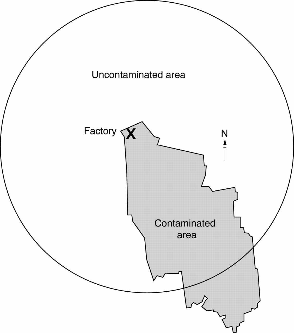
Theoretical studies of stack emissions17 and empirical monitoring18 show that peaks in fallout are concentrated in a direction that is influenced by meteorological conditions, and this factor can and should be included in statistical models.19 Also, particles precipitate out of a pollution plume at different rates according to their aerodynamic properties; thus depending on the size, peaks of pollution may occur close to and at some distance from an incinerator.17,19 The fallout from gaseous emissions may follow a different distribution from particulate emissions; although meteorological influences are still likely to be important, as the gaseous effluent will sorb on particulate matter. The importance of identifying an exposed (or non-exposed) area with reference to the possible effects of the local topography, prevailing winds, and any other meteorological peculiarities that may exist is illustrated brilliantly by the events at Seveso.2,20–23 Figure 5 shows the extent of the dilution that would have occurred had the epidemiologists in that study adopted an arbitrary circular approach. Clearly only about 20% of the circle contains an exposed population. Identifying the impact on health when using such a method would result in a fivefold drop in the ability to detect a hazard. In most developed societies, and in the absence of accidents, gross airborne environmental pollution is a thing of the past millennium. Society is exposed now to an insidious cocktail of different chemicals and very little is known about the health impact of these cocktails. Chemicals may act together synergistically; their effects may be additive or multiplicative; or speciation may occur.

The extent of dilution created by imposing a circle of 5 km radius without taking consideration of wind direction and speed.
The number of sampling sites used in this investigation was far in excess of the number typically reported in environmental studies. Sampling over such an extensive geographical area (over 10 km wide) implicitly allowed for the uncertain effects of fumestack height and of particulate size on the distribution of the metals in the soil. Nevertheless, because of the nature of spot sampling, problems remained with identifying the full extent of the population at risk. The spot sampling (fig 1 A and B) was the most accurate representation of the exposed population as it presented the information without distortion. However, this accuracy applied only to the area in the immediate vicinity of the sampling site. The close proximity of high and low values of arsenic and copper from sites that are almost adjacent showed that generalisation over distance is liable to be imprecise. To identify with greater accuracy the population at risk, the sampling sites would probably have to be at a frequency of at least four per km2. On this basis a city of the size and shape shown in figure 1 would require 392 sites. The cost (at 1999 prices) of measuring just one heavy metal in these sites would be £52 528, which makes this approach not viable for most research studies.
The use of contour mapping allows sampling at fewer sites, as the software provides estimates for each of the grid squares of the city based upon the measurements obtained at selected sites. The contour map of the distribution of arsenic showed the highest concentration of soil contamination to the south and west of the putative source of pollution (fig 2 A). Although the contour plot indicated that a much larger area was potentially exposed, it was similar to the distribution of high arsenic values shown by the red dots in figure 1 A. The contour map of copper showed high values to the immediate north west of the source of pollution, and also slightly lower values to the south west. Again, this distribution reflects the high values for copper shown by the red dots in figure 1 B. The lack of close comparability between the contour maps (fig 2 A and B), the spot maps (fig 1 A and B) and the correlation coefficients (tables 2 and 3), indicated that there may be additional sources of copper and arsenic in the environment as well as the putative source of pollution.
To be successful the software program requires sufficient sampling sites. Systematic sampling in each grid square is not the best option, however, as it is costly and potentially wasteful of resources as no account is taken of the distribution of the pollution plume. On the basis of wind direction alone we would identify, initially, areas to the west and south west of the putative source of pollution as the areas most at risk from airborne pollution. Our rationale for this is simple. In Scotland the winds from the south west are predominant with a frequency of about 25%–30%. However, these winds are usually turbulent and tend to disperse and dilute plumes from sources of pollution.24 The next most common winds (15%–20%) are from the north east. These winds are more often gentle and associated with anticyclonic conditions and temperature inversions. Temperature inversions are formed when the air is prevented from rising by a layer of warmer air above; inversions lead to the trapping of airborne pollution close to the ground. The frequencies of haze, mist, and fog which are useful meteorological variables for indicating the accumulation of pollutants in the stagnant air, are substantially more associated in Scotland with winds from the north east than with winds from any other direction24 whether in winter or summer.
There is much research interest in spatial exposure assessment25–27 and there are several ways in which it may be approached. The complexity of computer software generates its own problems. The resultant contour maps look exquisite but they imply a level of accuracy that is not necessarily present. The models are dependent on the inclusion of appropriate local characteristics and their use when delineating actual populations at risk must be made cautiously. The statistical data used to generate maps should always be scrutinised as they may result in quite a different interpretation from the mapped data. Also, efforts should be made to review the accompanying indices of uncertainty and variability that are generated during the mapping process.
We think that the best approach in identifying exposed populations from point sources of pollution is firstly, to ascertain from appropriate authorities all potential sources of pollution within recent history to identify cryptic sources that might contribute to the pollution patterns found. Secondly, local knowledge should be used about wind direction and speed to estimate the population likely to be at risk. This allows the provisional identification of the population most at risk from airborne pollution. Thirdly, the estimate of the geographical extent of the population at risk should be backed up by judicious use of soil sampling. Finally, contour mapping should be used to guide the final selection of exposed and non-exposed populations.
Answers to multiple choice questions on Causes and management of stress at work by S Michie on 67–72
(1) (a) false; (b) false; (c) true; (d) false; (e) true
(2) (a) true; (b) false; (c) true; (d) false; (e) true
(3) (a) true; (b) false; (c) true; (d) false; (e) true
(4) (a) true; (b) true; (c) false; (d) true; (e) true
(5) (a) false; (b) true; (c) false; (d) true; (e) true
Acknowledgments
Maps © Crown Copyright Ordnance Survey NC/01/23880.